UI/UX design that people find easy to use.
Research, flows and screens for websites and apps, tested with real users and built into a design system your team can keep using.

In short
UI/UX design is the work of understanding how people use a website or app, then designing the flows and screens that make it easy to get done what they came to do. MMC designs websites and apps for D2C, B2B and education brands, tests clickable prototypes with real users and packages the result as a design system.
- Start with users. Interviews and analytics show what people actually do.
- Design the journey. Flows and screens are shaped around the task, not the org chart.
- A system that scales. Reusable components keep new pages consistent.
Read the full guide
Monday Marketing Company (MMC) designs websites and apps for D2C, B2B and education brands, and builds the design system behind them.
What UI and UX design covers.
Six steps from understanding users to a design system your team can build from.
- User research. Interviews, data and support questions that show what users need.
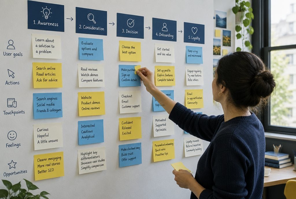
- Journey mapping. Flows that show how a visitor moves from first click to the goal.
- Screen design. Clear layouts for mobile and desktop, with real content in place.
- Usability testing. Prototypes tested with real people before anything is built.
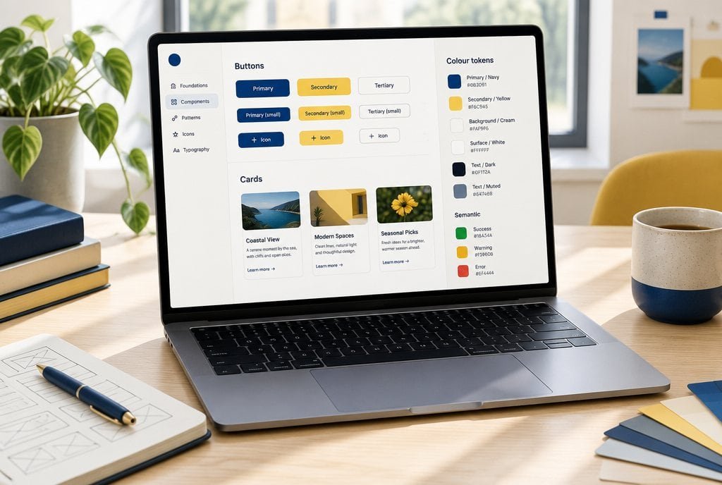
- Design system. Components and rules that keep every new page consistent.
- Handoff. Specs and files organised so developers can build without guesswork.
Why brands design with MMC
Good design makes the next marketing rupee work harder.
- Research before pixels. Decisions come from users and data, not taste.
- Conversion-minded. We design with the funnel and the analytics in view.
- Built to be built. Designs are reviewed with developers so they ship as drawn.
- Fits any audience. Shopping flows for D2C, enquiry flows for B2B and application flows for education.
Research What people do, not what we assume
- Could not find the size guide
- Looked for delivery time first
- Left at the long form
- Asked: is this in stock?
Journey Built around the task
- Land
- FindUsers stall here
- Decide
- Pay
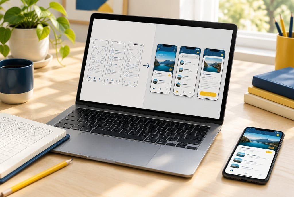
Wireframe to screen Structure first, then style
Prototype test Fixed before anything is built
- WorkedFound the product fast
- StalledMissed the size guide
- ChangeMove size guide up
Design system Reusable, so new pages stay consistent
Button
PrimarySecondaryInput
LabelTag
In stockSavedCard
The work, shown
What we actually do to design your product.
- 01
Listen to what users do.
Interviews and analytics show where people stall, before any screen is drawn.
- 02
Map the journey around the task.
Flows follow what people came to do, not how your business is organised.
- 03
Wireframe first, style second.
Structure is agreed on grey screens, so polish never hides a weak flow.
- 04
Test a clickable prototype.
Real users try the prototype before development, when fixes cost least.
- 05
Hand over a design system.
Reusable components and rules keep new pages consistent and quick to build.
Where it leaks
Five ways UX goes wrong.
- 1
Research
Designing for what the team assumes.
Teams know their product too well. Real users use it differently, and find different things hard.
How we run it. We interview users and study analytics, so design starts from what people actually do and where they get stuck.
- 2
User flows
Arranging pages by how the business is organised.
Users think in tasks, not in departments. A structure that follows the org chart makes tasks harder.
How we run it. We map the key journeys and rebuild the structure around the tasks people came to do.
- 3
Wireframes and UI
Jumping straight to polished visuals.
Visual polish on a weak flow only hides the problem. Structure comes before style.
How we run it. We move from wireframes to polished screens, checking each against the task it must support.
- 4
Prototype and usability testing
Finding out about problems after launch.
Fixing a problem in a prototype costs a fraction of fixing it in a live product.
How we run it. We build clickable prototypes and test them with real users before development starts.
- 5
Design systems
Designing every page from scratch.
Without shared components, sites drift and every change takes longer.
How we run it. We build a design system of reusable components and rules that your designers and developers can keep using.
Selected work
A few of the sites we have designed for.
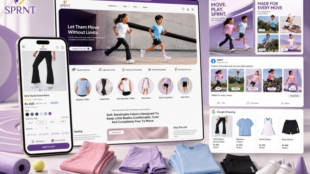
 Kids' activewear: the ad and the product page tell one story.See the work
 Edu tours: a site and creative built for students and parents.See the work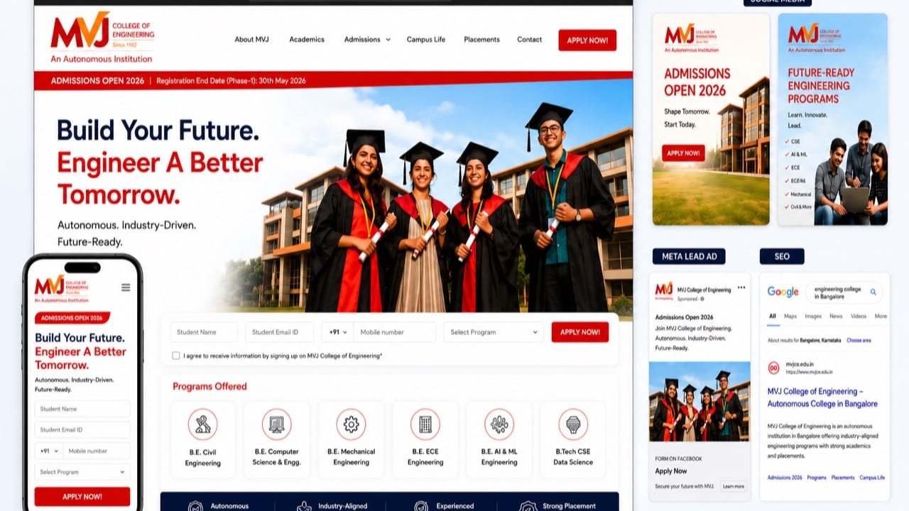
 MVJ College of Engineering: a college site built for families deciding.See the work
A few more. Hover or tap a logo.
What we read
- Task completion
- Whether people finish what they came to do.
- Time on task
- How long the main tasks take.
- Drop-off points
- Where people give up.
- Consistency
- Whether pages and components behave the same way.
Read with real users, not guessed.
How the work runs
How we run UI and UX work, step by step.
Step 1
Understand the users
Research with the people who use or buy, and a read of your data.
You get: A clear picture of who does what and why.
Step 2
Map and wireframe
User flows and wireframes for the journeys that matter.
You get: An agreed structure before any polish.

Step 3
Design and test
Screens are designed and prototypes tested with real users.
You get: Proof the design works before development.
Step 4
Build the system
A design system of reusable components and rules.
You get: A kit your team can keep using.
Timing depends on scope. We agree it with you before work starts.
UI/UX for products where ease decides the sale.
A good fit
Users struggle with your site or app, or your team keeps redoing screens.
Better flows lift conversion for D2C stores, make B2B sites easier to trust and help families complete an enquiry.
Not a fit
You want decoration without research, or want us to skip user testing.
Design that is not tested with users is guesswork, and we will not sell it as research.
Common questions
Questions about UI/UX design.
What is UI/UX design?
UI/UX design is the work of understanding how people use a website or app, then designing the flows and screens that make it easy to get done what they came to do. UX is how it works; UI is how it looks.
How does UI/UX design work with MMC?
We research the users, map flows, wireframe and design screens, test clickable prototypes with real users, and package everything as a design system.
What does UI/UX design cost?
We quote per project, after a call, once the scope is clear: what you need, how much of it, and what it has to connect to. The scope and the fee are agreed in writing before work starts.
Do you guarantee results?
No. Nobody can guarantee a conversion lift from design alone. We commit to research, testing with real users and a clear design system, and honest reporting.
Who is UI/UX design for?
Teams building or fixing a website or app. Not only D2C. We work with D2C, B2B and education brands, and set the work up differently for each: D2C on shopping and checkout flows, B2B on enquiry and demo flows, education on course, fee and application journeys.
What do you need from us?
Access to your product or site, analytics, your brand assets, and a few users or customers we can talk to.

See where users get stuck.
On a call, with a senior strategist. We look at your key journeys together.
Run the numbers, read the method
Tools and guides behind the numbers.
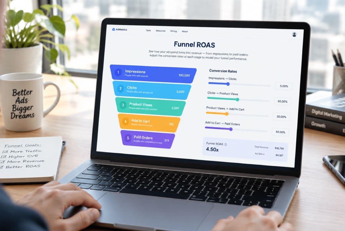 CalculatorFunnel ROASWhich step between an impression and a paid order is leaking.Open the calculator
 GuideHow D2C brands test ad creativeA repeatable way to test hooks and angles, read the results against your break-even ROAS and refresh creative before ads tire. Written for D2C brands.Read the guide
Ready when you are
See where users get stuck.
On a call, with a senior strategist. We look at your key journeys together.